Showing posts with label Commercial Interior Design. Show all posts

Tuesday, October 16, 2012

Adaptive Re-Use Project: From A Factory Employee Lunch Room Into A Factory Outlet Store

This is a project that I completed several years ago which has since went away and been through several incarnations in the past several years. The space was inside the Hart Schaffner Marx factory in Chicago (Des Plaines), IL. It was being used as an employee lunch room with vending machines, refrigerators, sinks, cupboards, etc. - a mish-mosh of stuff. And dirty. I wish I had retained my original 'before" pics but they were lost in a pc crash last year. Suffice it to say, that this was a daunting task on a shoestring budget.

The project was a collaborative effort with my client at the corporation that owned HSM at that time. He would busy be on other projects and traveling. Once we devised the concept / design together, I was on my own.


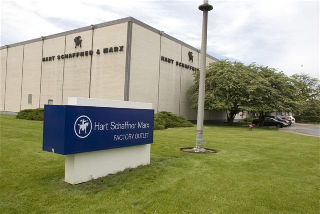
The factory was built around 1971 and is actually two facilities - manufacturing and distribution. Each with their own employees, facilities and entrances. The store would have to function within a situation where distribution employees would need to pass through the store to enter the distribution / loading dock area and offices by 7:00 AM. The store, however would not open until 10:00 AM. A movable fence for the merchandise area of the store was the solution for the distribution employees. They would enter from the main outside entrance, then a vestibule, then pass by the cash / wrap area to an inner door. The offices, which previously were behind a mullion surround glass wall / door would be back painted the HSM blue color with a logo for privacy and store aesthetic purposes.


A contracting company was hired and the inevitable process of acquiring the proper village permits was begun. This was not in the city of Chicago, but the near suburb of Des Plaines. Anything involving exterior signage - in this case two - was a whole separate process.


ADA requirements was another prevalent matter. Parking was a concern, there was only space for four to five cars in front (employees parked in a lot behind the facility) there would need to be two handicap spaces as well as a partial curb cut. As well, the distribution employees needed a place to go outside for a cigarette break - notice the cigarette disposal device to the left of the entrance.

A floor plan was created and a fixture purchase list put in place - very simple, affordable, utilitarian and sourced locally.


The contracting / construction company was the same as used by the parent corporation for their exhibit designs at trade shows who were also experienced in retail construction. This made for a good fit as we were already very well acquainted. A simple retro inspired vinyl floor tile was chosen to "punch" the store up a bit. We were also in luck with an existing design element. The wall of "portholes" was an interesting feature as well as letting in natural light without losing precious wall space for hang rail.


In the end, it took five months to navigate the village of Des Plaines code requirements as well as corporation conflicts, concerns, union intervention and territorial issues from within the factory / distribution staff before the store opened - under budget by $11K.


The store was open for a little over a year. The parent corporation went into bankruptcy in the beginning months of the financial crisis, lost their downtown Chicago headquarters, moved some offices to a facility nearby and others to this facility. The store then became the company's Custom Shop and more recently turned into office cubicles.

Tuesday, September 25, 2012

Revised Front Elevation - A Store Re Model

When I created the original front elevation for this store re-model in Hinsdale, I was experimenting with new software - SmartDraw - which, as a trial I was allowed 3 printed drawings. But as a trial, these had a huge watermark with their logo etc in the lower right corner. I have since been experimenting with Goggle Sketch Up. It lacks some of the more easily dropped in items (doors, windows etc) but for the price ($0.00), Sketch Up is very attractive. I'm still figuring out how to properly scale, measure etc - but it's coming along!

Wednesday, August 1, 2012

A Store Re-Model


This is a story board for a store "face lift" in the Chicago suburb of Hinsdale. It's a small convenience store just down the road from a very big country club. The owner sells the typical convenience store items: soda, various junk food items etc., but as well sells expensive imported cigars, has a huge inventory of wines - some very pricey and - live bait! There is a local lake that's stocked with fish as well as a pond in the confines of the country club.

The owner is also adding a deli counter and is currently waiting for the Village of Hinsdale approval on that as well as the back prep area. More to follow! I will have before and after pics at some point. Wish me luck!

Saturday, May 12, 2012

Design For A Marketing Company Reception Room

A marketing company specializing in medical studies was able to get a suite of offices in an old industrial building located in Chicago's West Loop area. It was a suite of offices that the client would be able to customize the interior - a rare opportunity for a lease. I was brought in mainly to design the reception area and project manage that aspect as well as advise on art purchases for the entire suite of rooms.


The client had missed another space opportunity with an exposed brick wall - so rather than paint all the walls - we added a grass cloth wallpaper to one wall for texture. This was carried over to the reception half wall too. As well - even though the client was aware that this building owner was marketing the office suites as "loft conversions" and the exposed HVAC and the rough plaster columns were part of the package - the client at least wanted a solution to bring the columns up a grade. I contracted an artisan who specialized in faux paint finishes and he came up with a design that utilized the rough plaster with our color palette so the columns blended in to the overall design scheme.